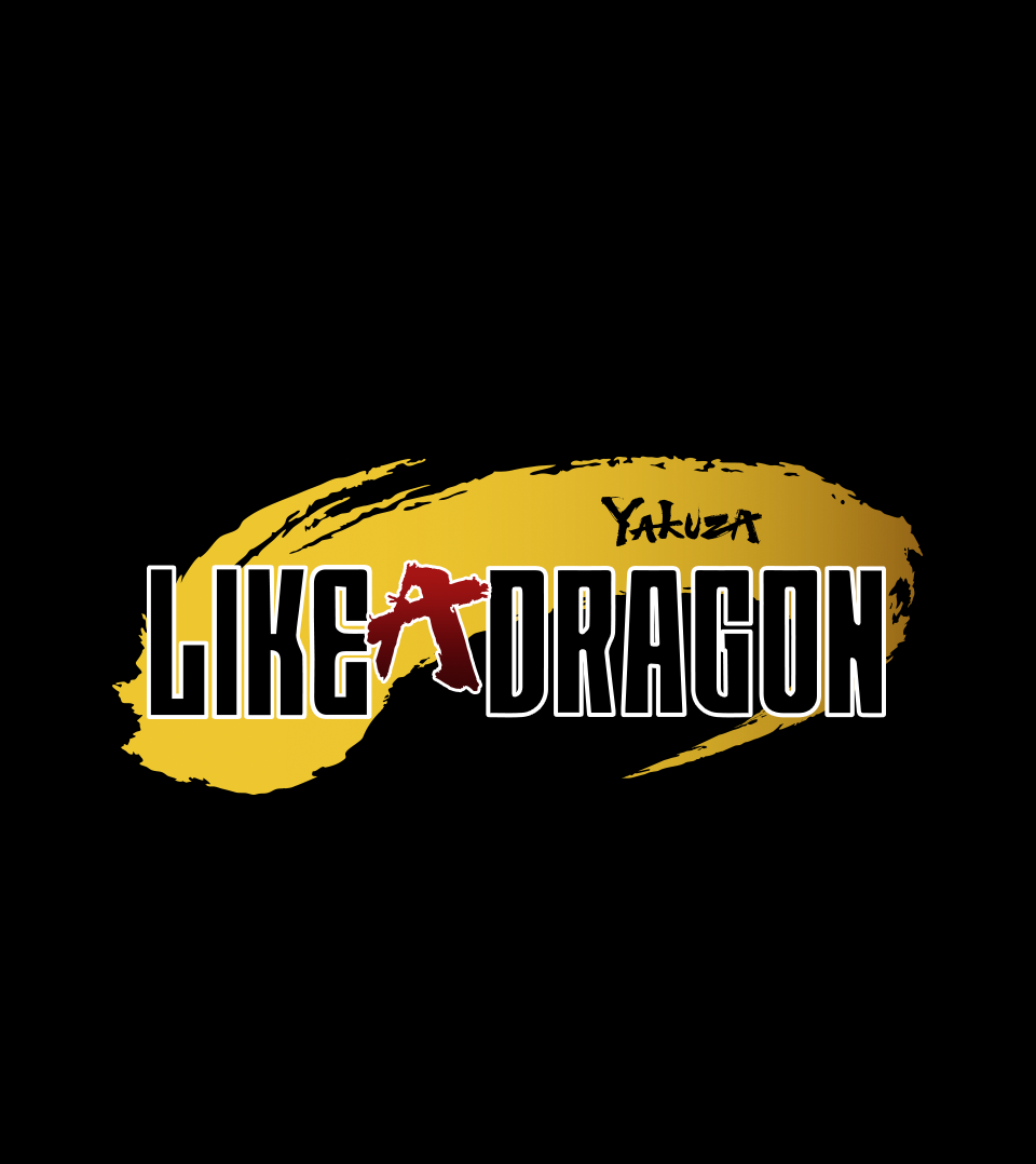
Yakuza: Like A Dragon
Overview
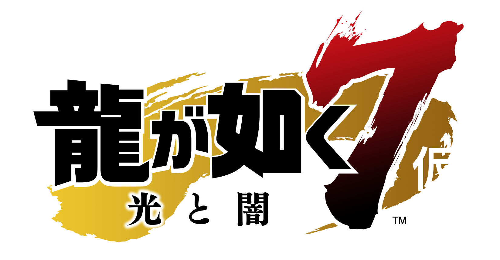
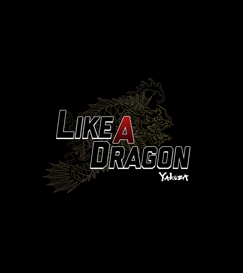
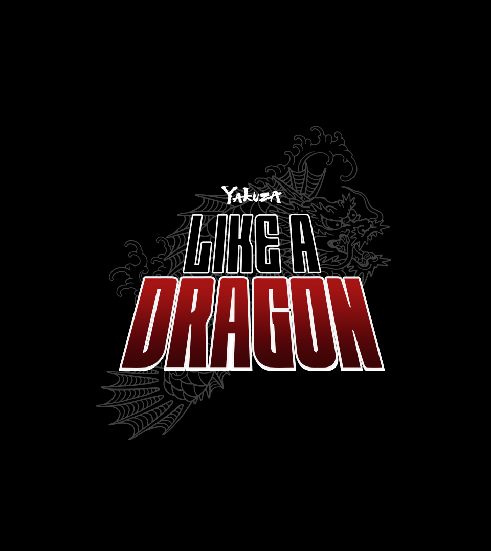
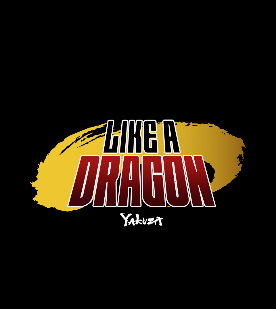
Following six successful installments of the Yakuza franchise, Sega prepared to introduce a rebooted chapter to Western audiences. The project required developing a refreshed logo that maintained the spirit of the original Japanese identity while resonating with a broader international market.
Challenge
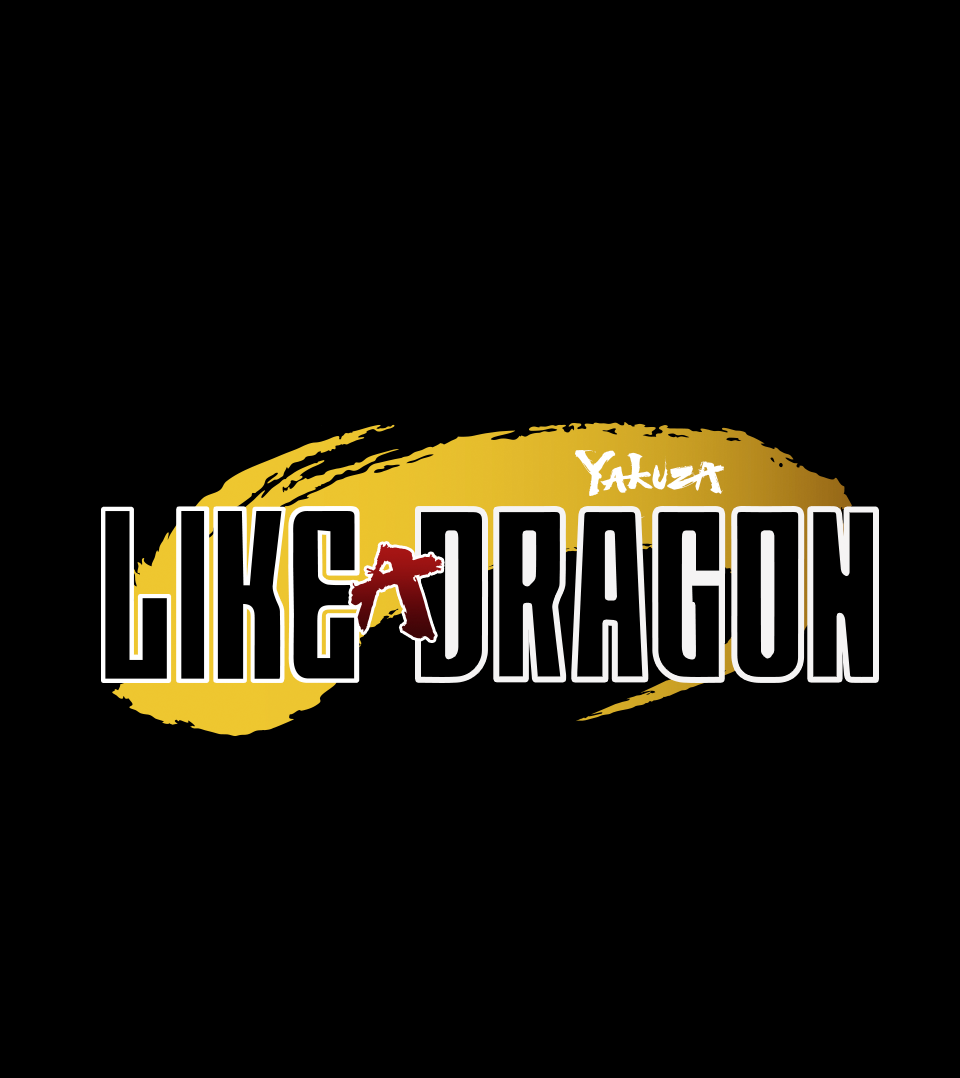
The client provided the Japanese logo as a foundation, along with specific parameters that needed to be respected. However, the Western adaptation required refinement for clarity, tone, and brand positioning.
Role
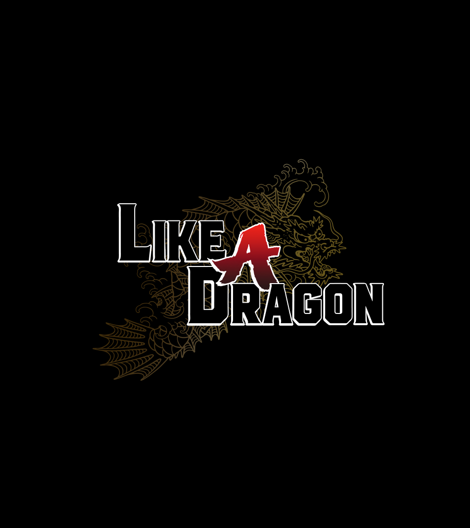
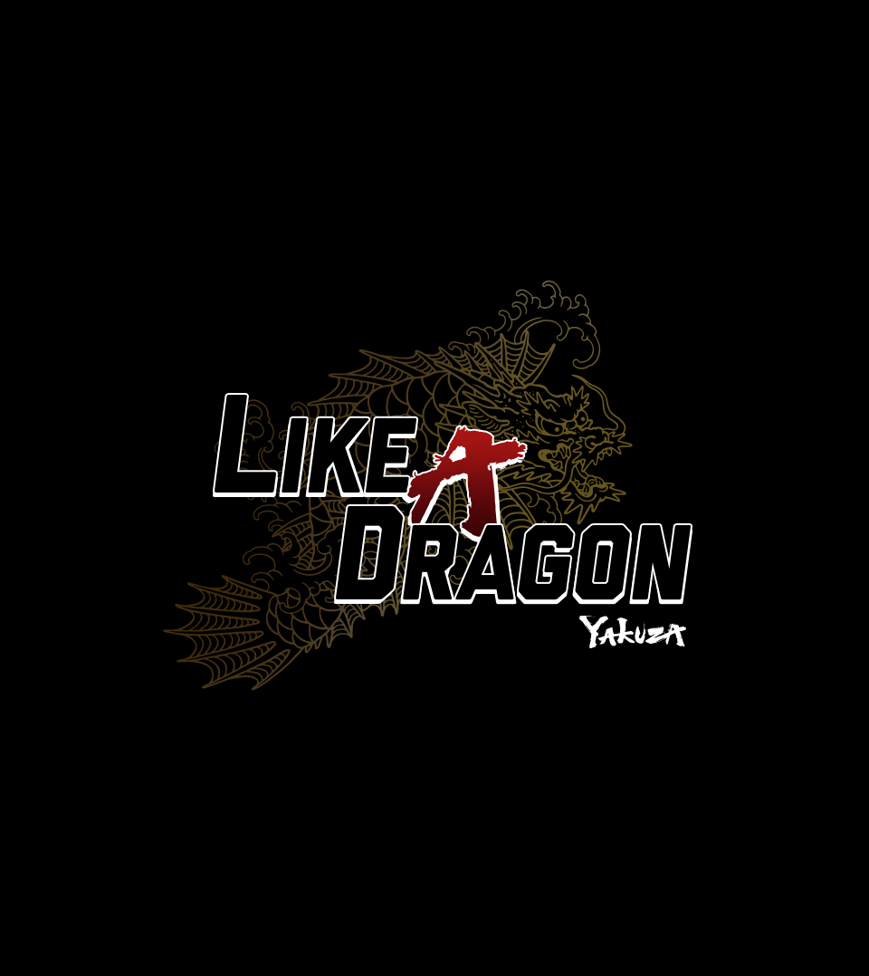
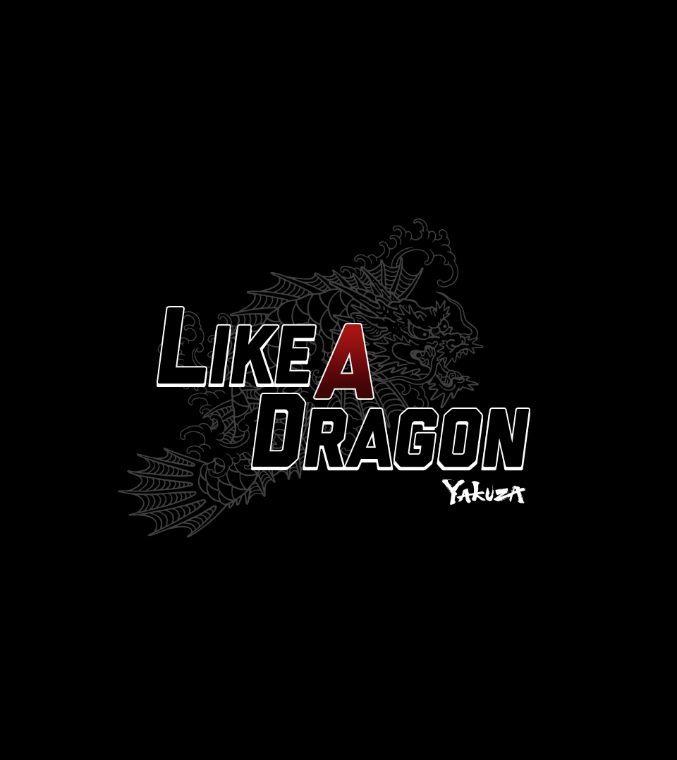
Working together with other Art Directors, we collaborated on multiple directions that balanced franchise familiarity with a refreshed, Western-facing identity. I worked within the provided design parameters while identifying opportunities to modernize structure, typography, and composition.
Outcome
The final logo direction successfully bridged Eastern and Western branding sensibilities, delivering a refreshed identity that maintained the integrity of the Yakuza franchise while signaling a bold new chapter. The mark reinforced brand recognition without relying on traditional sequel numbering.
Client: Sega
Agency: Liquid Advertising
Exec. Creative Director: Patrick Runco
Assoc. Creative Director: Jacob Boghosian
Sr. Art Director: Chris Cadiz
ORIGINAL LOGO
